What this article says in 30 seconds
- Sophisticated black and gold interiors use black for structure and gold as a restrained warm accent
- Cream walnut and pale stone prevent the palette from becoming flat harsh or overly theatrical
- Layered natural ambient task and accent lighting is essential because black absorbs light
- Use AI to test the palette room by room then verify finish samples scale feasibility and disclosure
Use DesignSense for this workflow when you need to:
- Homeowners seeking a dramatic but controlled interior
- Designers testing modern luxury or restrained Art Deco concepts
- Hospitality and rental spaces that need a memorable evening atmosphere
- Agents visualizing premium listing concepts
Black and gold interior design works when black creates structure and gold adds warmth, reflection, and emphasis. It fails when every surface competes to look expensive. The more sophisticated formula uses matte black or black-stained wood, brushed or aged brass, cream upholstery, walnut, pale stone, and layered light.
DesignSense AI helps you test that balance from a real photo before you paint cabinetry, order fixtures, furnish a room, stage a rental, or present a design concept. You can compare a lighter black-and-gold scheme with a more immersive one while keeping the actual windows, walls, and circulation visible.
For the larger workflow, read how to use AI for room redesign and renovation visualization.
Quick black and gold interior formula
Use DesignSense AI to test:
- Matte black paint, black-stained timber, charcoal stone, or black metal
- Brushed brass, aged brass, bronze, or soft gold used in small repeated accents
- Cream, ivory, pale gray, walnut, and light stone for relief
- Geometric lines through paneling, rugs, lighting, or art
- Natural daylight plus ambient, task, and accent lighting
- A mix of matte, textured, and softly reflective finishes
Black and gold often borrows from Art Deco, but it does not need to become a period room. The introduction to Art Deco from the Victoria and Albert Museum describes the movement's mix of geometry, modernity, luxury, and many cultural influences. The Art Deco collection overview from the Met highlights lacquer, metalwork, gilding, rare woods, and refined craftsmanship. A current interior can translate those ideas with restraint and more practical materials.
Room-by-room image guide
Start by deciding where black will carry visual weight: one wall, built-ins, cabinetry, furniture, or metal framing. Then choose one gold-toned finish and repeat it selectively.
Black and gold living room: build contrast around the architecture
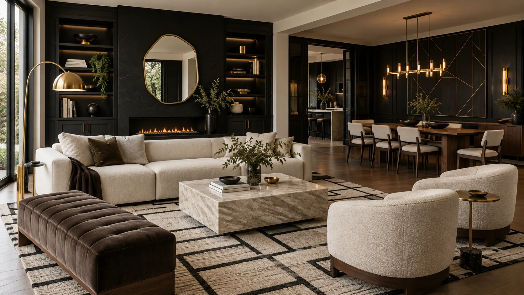
Image direction: dark structure, light upholstery, warm metal accents. Matte black built-ins and a fireplace wall frame the room, while cream seating and pale stone protect the center from feeling heavy. Brass appears in lighting, hardware, and a mirror rather than covering large surfaces.
If the existing room receives limited daylight, test black on furniture or built-ins before applying it to every wall. Light placement matters as much as paint color.
Black and gold bedroom: keep the contrast quiet enough for rest
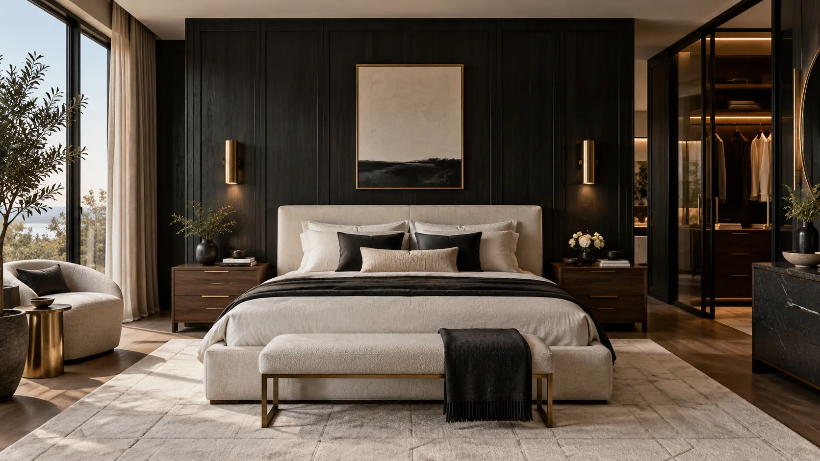
Image direction: one dark architectural plane with a soft foreground. Black-stained wood adds depth and grain behind the bed, while cream fabric, pale flooring, walnut, and diffused daylight keep the room calm.
Use warm, dimmable bedside lighting and avoid glossy black directly opposite the bed if reflections feel distracting. Gold works best here as hardware, frames, or sconces.
Black and gold kitchen: let walnut and stone soften the cabinetry
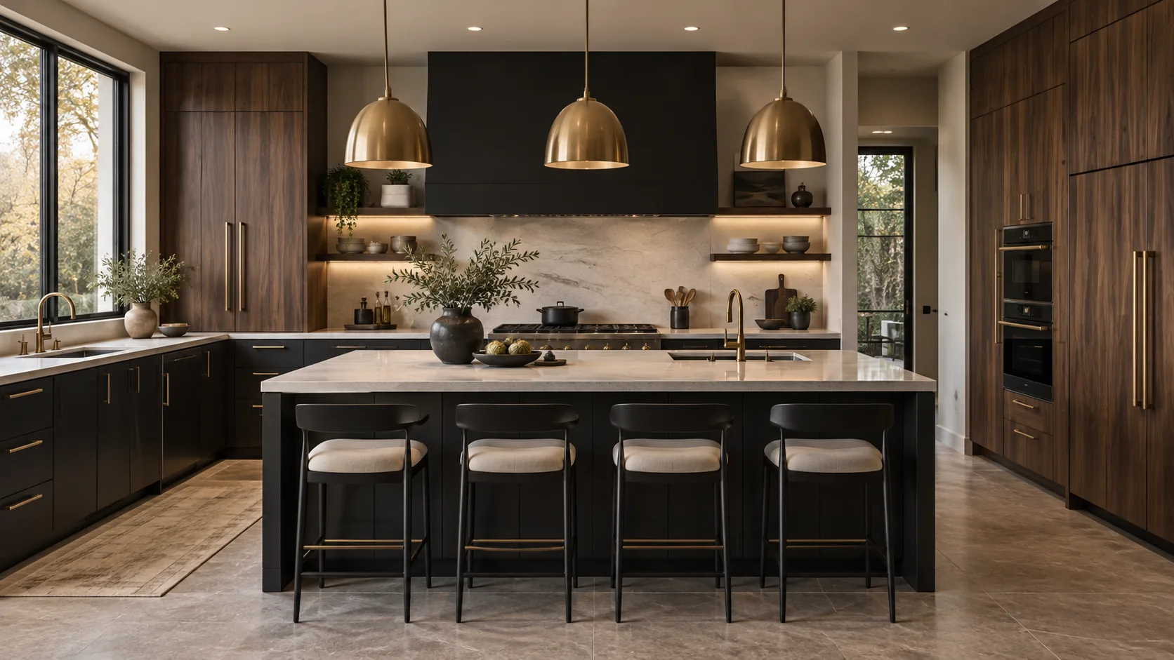
Image direction: black at working level, warm wood at full height, pale stone across the center. The three materials divide the visual weight. Brass repeats through handles, faucets, and pendants without becoming the main surface.
Ask the AI to preserve appliance sizes, ventilation, sink location, counter clearances, and aisle width. Dark cabinetry also needs enough task lighting to make preparation surfaces safe.
Black and gold bathroom: prioritize light, reflection, and maintenance
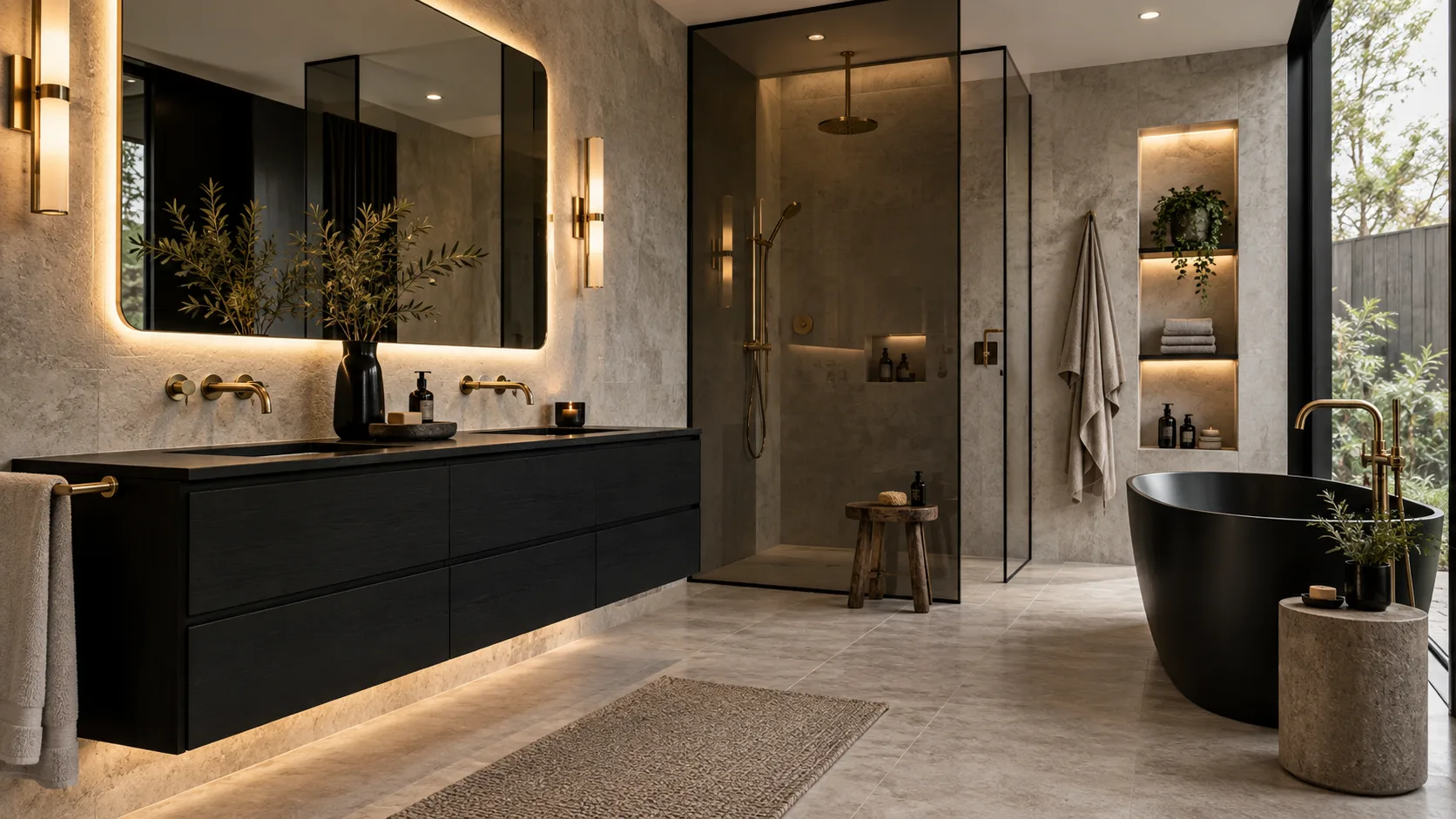
Image direction: concentrated black elements against a pale mineral shell. Warm integrated lighting reveals the texture of the stone and keeps the black vanity from reading as a flat block. Brass appears at touch points where its warmth is useful.
Compare polished and brushed metal carefully. Water spots, fingerprints, cleaning products, and finish compatibility matter more in bathrooms than the concept image can show.
Black and gold dining room: use one strong lighting statement
Turn one room photo into a clearer next step.
Upload one room photo, test a few directions quickly, and keep the option that is easiest to present or ship.
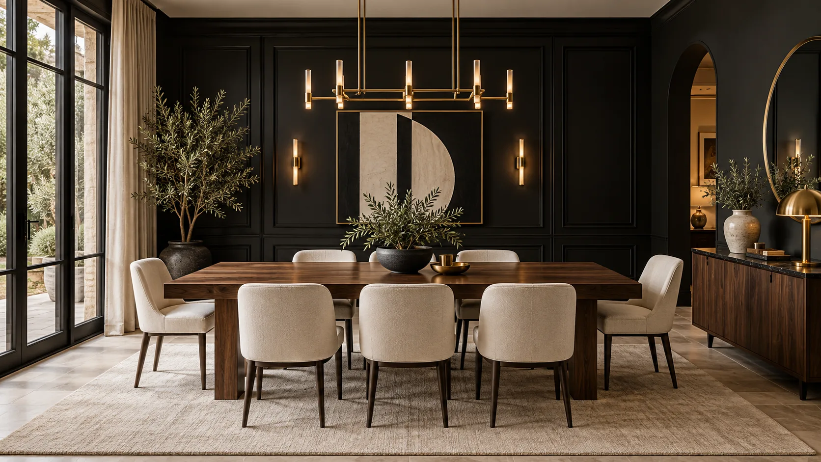
Image direction: a dark backdrop with a bright social center. The cream chairs, wood table, and pale rug make the dining zone legible against the black wall. One geometric chandelier supplies the gold emphasis.
Confirm the fixture's real scale and hanging height. AI often enlarges decorative lighting beyond what the ceiling, table, or electrical box can support.
Black and gold entryway: make the first impression concise
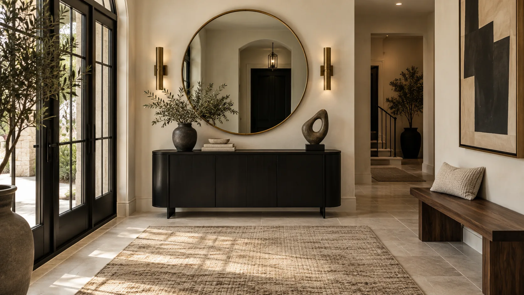
Image direction: a compact black anchor with gold at eye level. The console grounds the wall, while the mirror and sconces reflect light. Cream plaster and pale stone preserve brightness around the dark furniture.
Keep the path, door swing, and storage needs visible in the prompt. A dramatic entry still has to handle keys, bags, shoes, guests, and daily movement.
Black and gold home office: control glare as well as mood
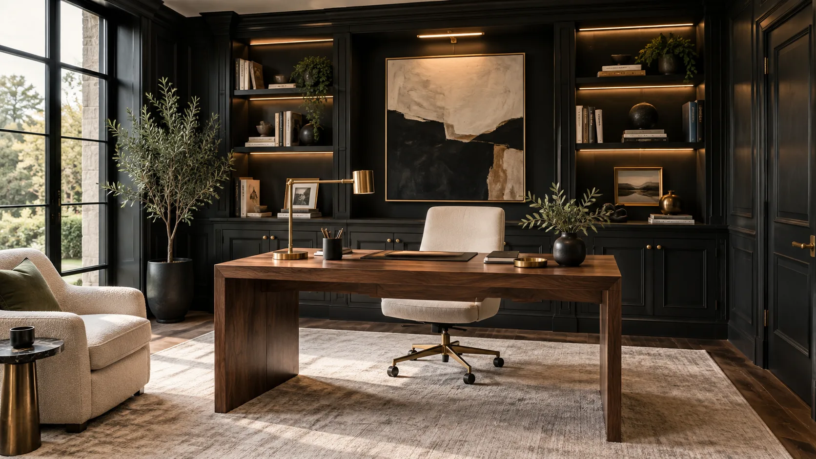
Image direction: black storage around a warmer working center. Walnut and cream separate the desk and chair from the built-ins. Brass task and shelf lights create useful points of brightness instead of a single theatrical glow.
Check screen glare, color accuracy, task light placement, and the video-call background. Warm decorative lighting alone may not be enough for focused work.
Black and gold patio and exterior: translate the palette into durable materials
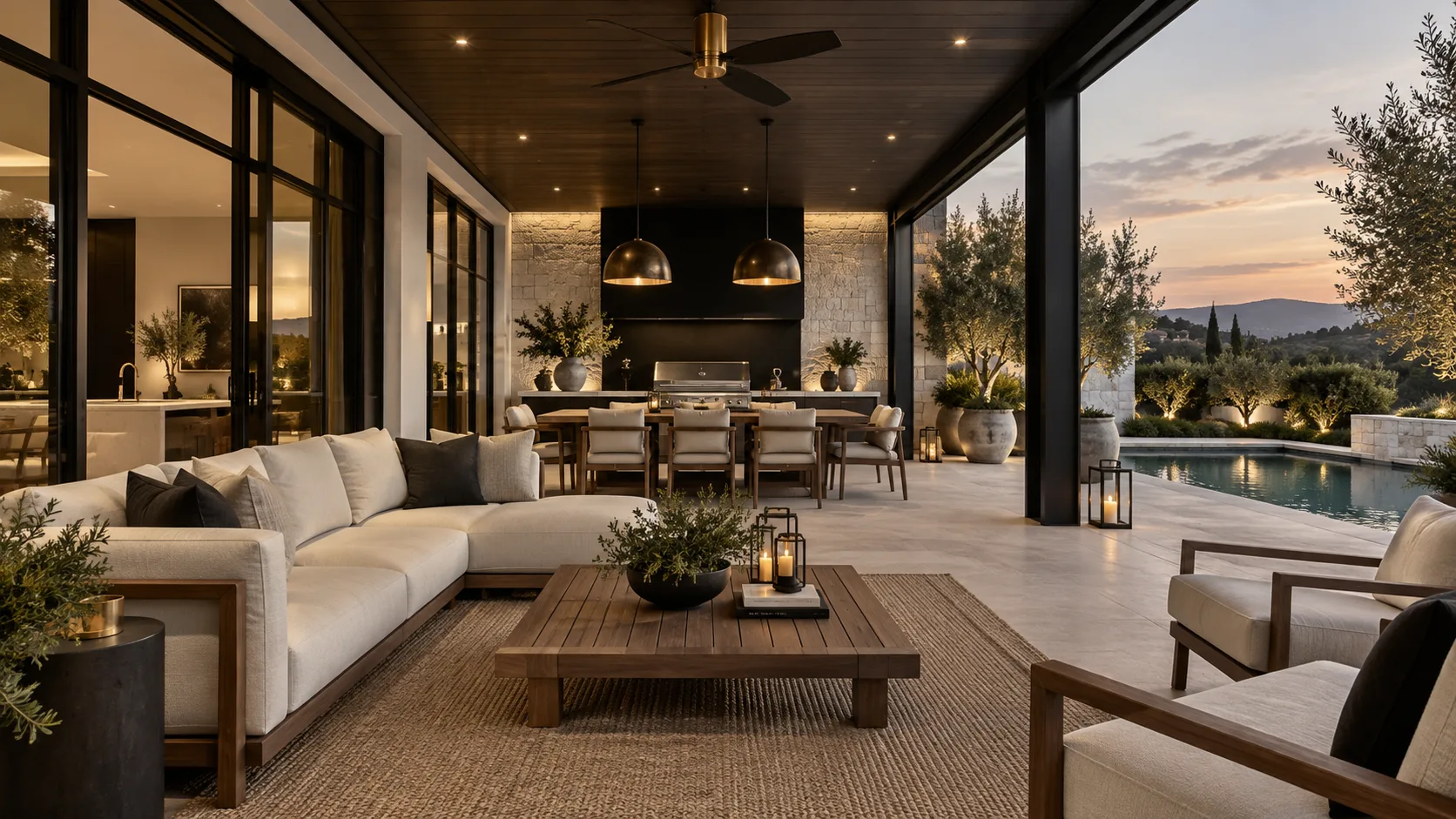
Image direction: black framework, bronze light, and pale weather-ready surfaces. The palette moves outdoors through metal frames and lighting rather than delicate decorative finishes. Cream cushions and pale stone keep the patio readable after sunset.
Verify corrosion resistance, exterior ratings, heat gain, fading, drainage, and local electrical requirements. Interior brass finishes are not automatically suitable outside.
Prompt examples for DesignSense AI
Specify where black belongs, how much gold is allowed, and what lightens the room:
- "Redesign this living room with matte black built-ins, one black fireplace wall, cream seating, walnut furniture, pale stone, restrained brushed brass lighting, and realistic daylight."
- "Create a black and gold bedroom with a black-stained wood headboard wall, cream upholstered bed, walnut nightstands, brushed brass sconces, pale wool rug, and warm dimmable lighting."
- "Show this kitchen with matte black lower cabinets, walnut tall storage, pale stone counters, brushed brass hardware, cream backsplash, and the same appliance and plumbing layout."
- "Update this home office with black built-ins, a walnut desk, cream ergonomic chair, brushed brass task light, warm shelf lighting, pale rug, and a clean video-call background."
For a more glamorous and decorative interpretation, compare the Hollywood Regency style guide. For a lighter companion palette, use the cream and white rooms guide.
What to review before choosing the palette
Black and gold concepts need close review because dark surfaces and reflective finishes can conceal practical issues:
- Is black used to frame the room rather than flatten every surface?
- Does cream, wood, or stone provide enough visual relief?
- Is the gold finish consistent and restrained?
- Are daylight, ambient, task, and accent light all represented?
- Did the AI preserve windows, walls, doorways, ceiling height, and room dimensions?
- Are kitchen, bathroom, exterior, and electrical changes feasible?
- Would a buyer or guest understand which elements are conceptual?
DesignSense is useful for testing contrast, finish placement, and atmosphere before committing. It is not a substitute for paint samples, metal finish samples, lighting calculations, construction documents, or installation review.
Final workflow
Create one lighter concept with black furniture or built-ins, then one immersive concept with a larger dark surface. Compare both in daytime and evening conditions. Choose one black finish, one gold-toned metal, one warm wood, and one light material, then carry that four-part system through the bedroom, kitchen, bathroom, dining room, entryway, office, and patio.
The strongest black and gold interior feels luxurious because the materials and light are controlled, not because every object shines.
Turn one room photo into a clearer next step.
Use DesignSense to move from room photo to a clearer concept without waiting on a slower manual workflow.