


01
Identify your existing wood tone
Select the main wood surface in the room, such as flooring, cabinets, furniture, trim, beams, or built-ins.
Stop guessing which wood tones match. Choose your existing wood floor, cabinets, furniture, or trim to get compatible wood pairings, contrast options, undertone guidance, and colors to avoid. Free, instant, and no signup required.
Select your existing wood tone, where it appears, and what you want to match to get compatible wood pairings.
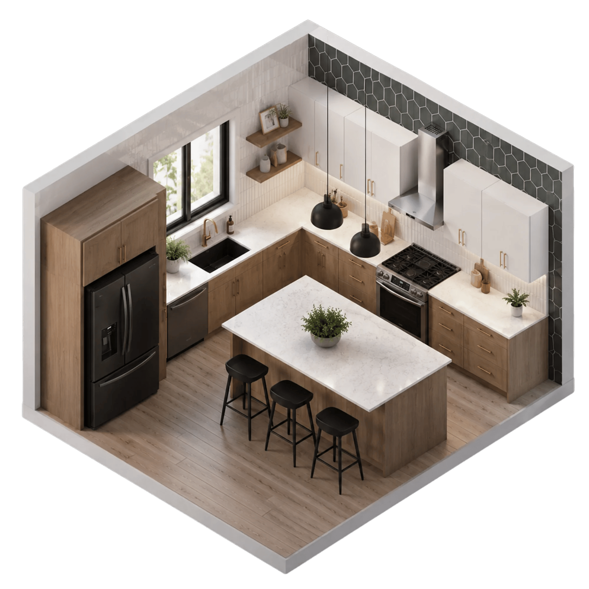
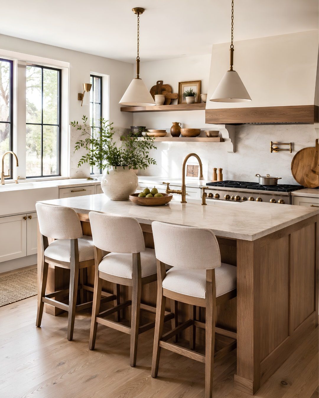
A wood tone can look compatible on a swatch and still feel wrong once it is beside your floors, walls, cabinets, upholstery, lighting, and metal finishes. Upload a photo of your space and use DesignSense AI to visualize the full room direction before you buy. See how wood furniture, flooring, cabinets, paint, and decor work together in your actual room lighting.
See These Wood Tones in My RoomWood is rarely just brown. It can lean yellow, orange, red, gray, neutral, warm, cool, light, dark, rustic, polished, or almost black. Two woods can both look beautiful on their own and still clash when their undertones sit beside each other.
The challenge becomes harder because wood appears in different places at different visual weights. Floors, cabinets, trim, tables, chairs, shelving, beams, and built-ins all compete for attention in different ways.
This wood tone matcher helps you identify a compatible direction before buying new furniture, flooring, cabinets, or decor. It gives you a best match, a contrast option, paint guidance, metal finish guidance, and a pairing to avoid.
Select the main wood surface in the room, such as flooring, cabinets, furniture, trim, beams, or built-ins.
Tell us whether you are matching furniture, floors, cabinets, a table, chairs, shelving, decor, or another wood surface.
Instantly receive matching tones, contrast options, paint companions, metal finishes, and a wood tone to avoid.
Wood tones can lean yellow, orange, red, neutral, gray, or almost black. Matching undertones is what makes mixed wood feel intentional instead of accidental.
Use the matcher to narrow the direction before you buy furniture, stain samples, floors, cabinets, or decor.
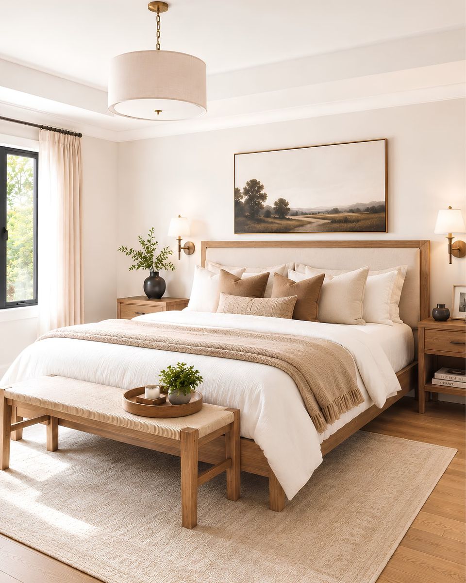
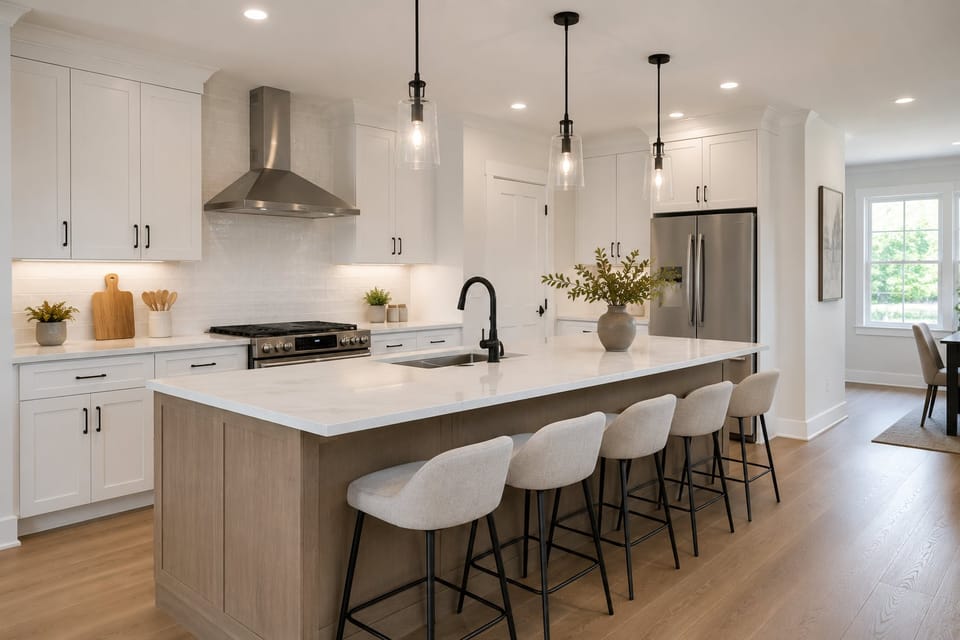
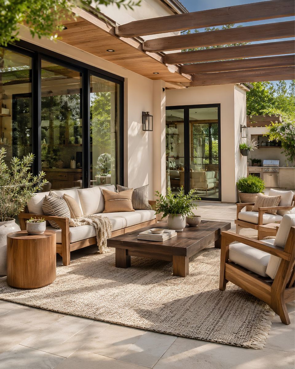
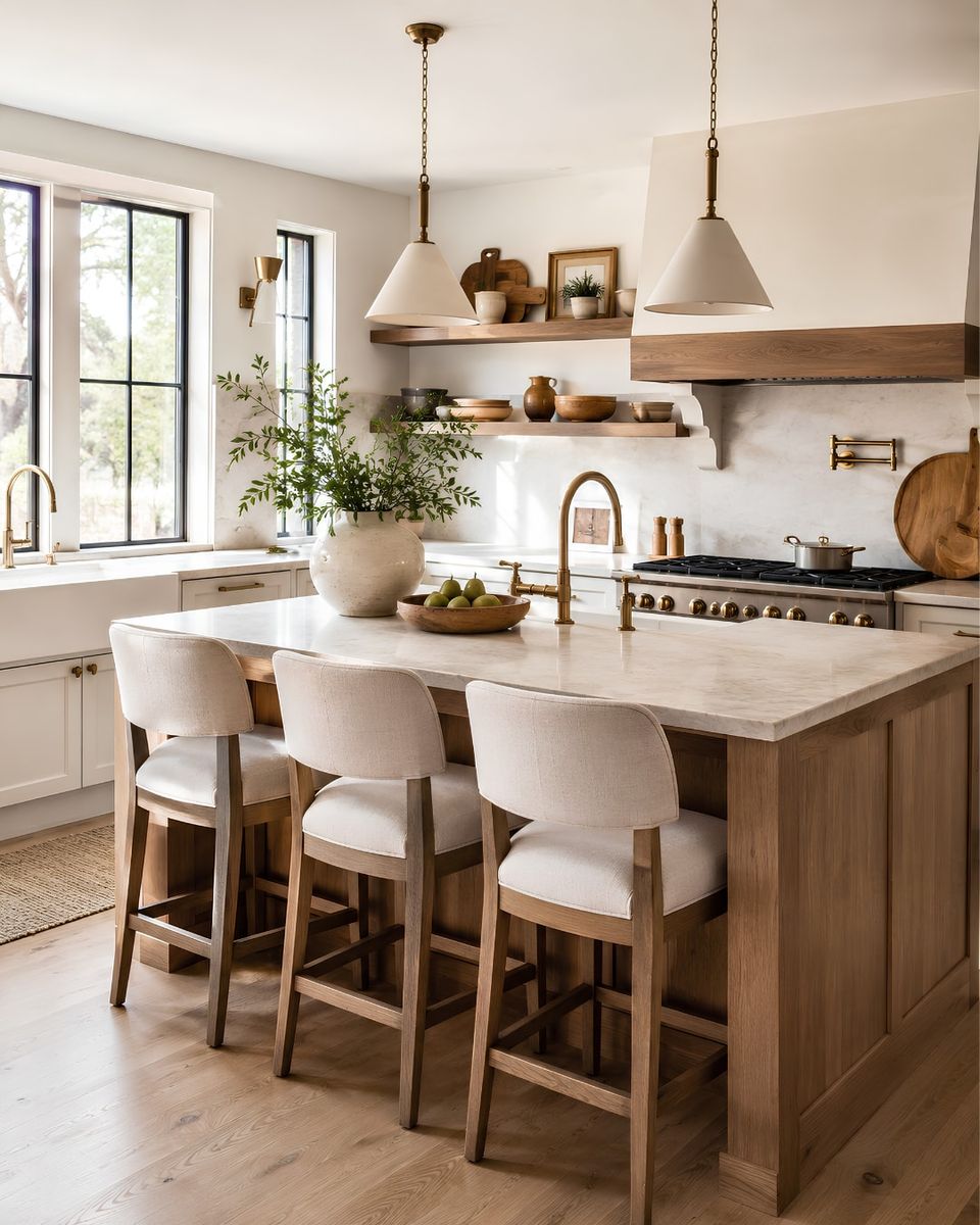
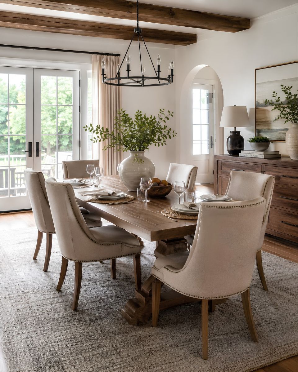
A layered room does not need every wood piece to match. It needs a clear dominant wood, a controlled undertone story, and enough contrast that different woods look intentional.
The matcher helps you decide when to stay close, when to create contrast, and when to avoid a tone that could make the room feel too orange, too red, too gray, or too heavy.
DesignSense AI lets you preview a complete room direction from a single photo, so you can test wood, paint, furniture, metal, and decor together before buying.
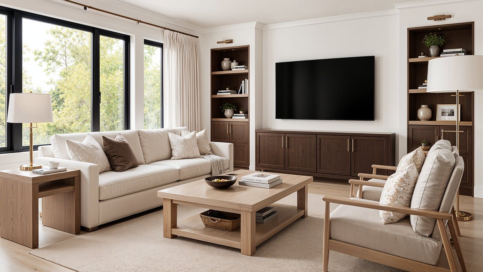
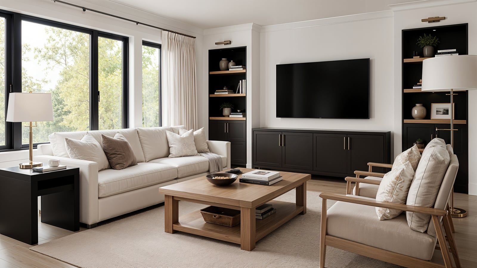
The wood tone matcher is just the start. Here's what else can help you plan the room:
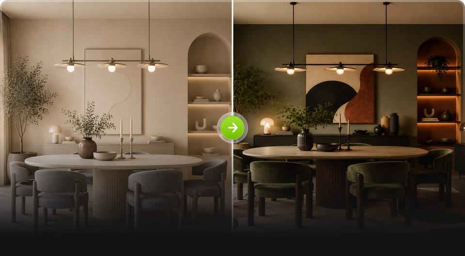
Generate balanced color palettes for any interior style
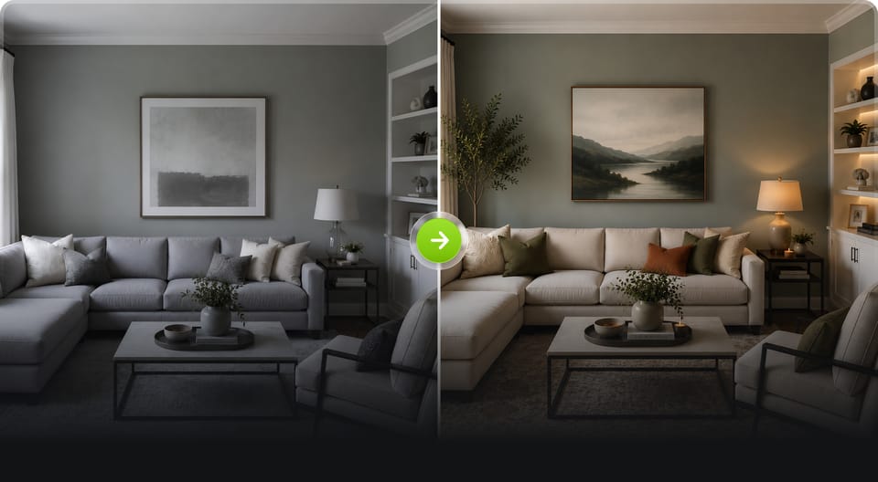
Identify warm, cool, or neutral paint undertones
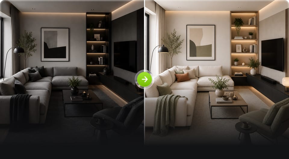
Create balanced room color proportions instantly
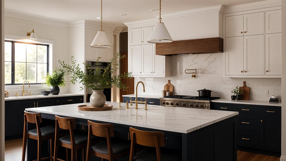
Visualize room transformations and redesign concepts instantly
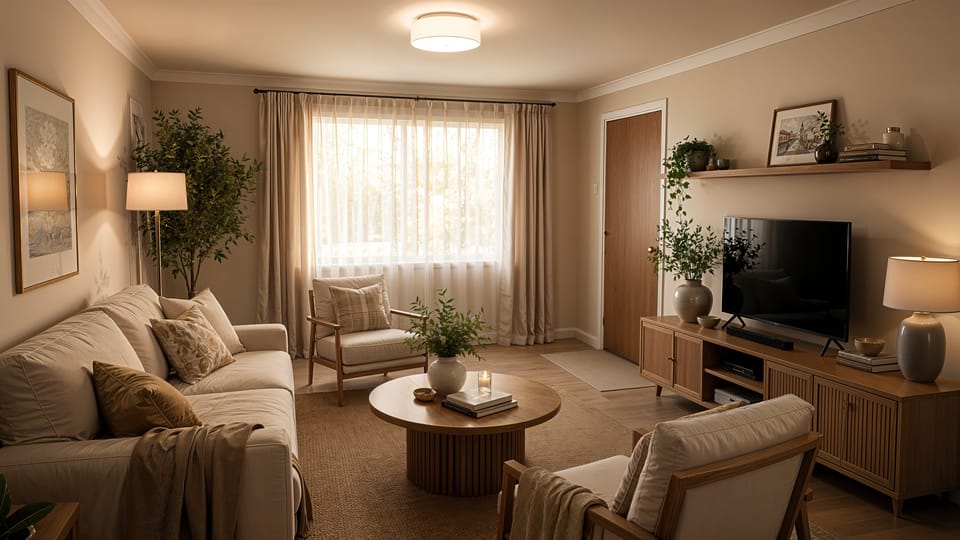
Plan renovations with photorealistic AI home redesign concepts
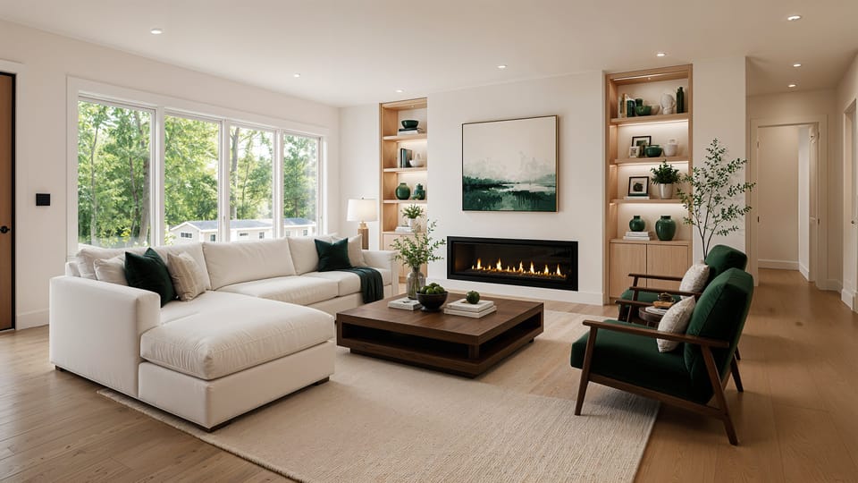
Help clients visualize renovations before project approval
Harness the power of artificial intelligence to Redefine
Interior Aesthetics and Functionality
